Case study
Google Pixel
Airport Retail Experience
Overview
Turning a vending machine into a digital storefront
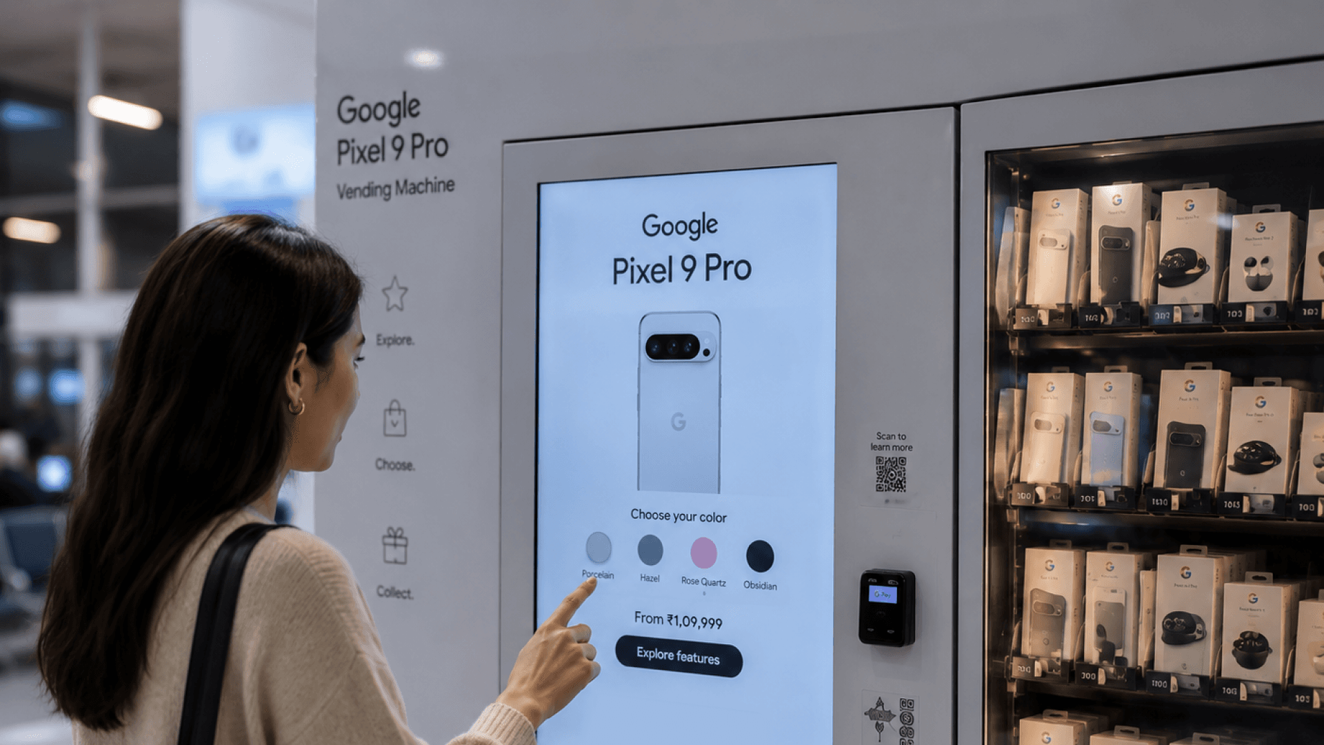
Google was exploring a new way to bring Pixel products directly to travellers through vending machines at Chicago Airport.
The physical machine handled the purchase.
I designed the 47-inch interactive touchscreen that turned the machine into a space for product discovery, education, and marketing.
Approach
A digital experience built around product exploration
Rather than treating the screen as a simple catalogue, we designed it as a miniature digital storefront.
Discover Pixel → Understand products → Explore features → Learn about Google services → Purchase
The interface brought together product discovery, education, and marketing within a single large-format experience.
Outcomes
A physical + digital retail experience
47"
Interactive touchscreen
Pixel
Phones + accessories
Google Fi
Service discovery
Chicago
Airport installation
Design collaboration
Initial challenge
An airport isn't a retail store
Travellers aren't entering the experience with the intention of spending 30 minutes browsing.
They are:
Moving between terminals
Carrying luggage
Waiting for flights
Looking for something quickly
Often unfamiliar with Pixel
So the experience had to communicate value within seconds. How do we make someone stop, understand, explore, and act?
The opportunity
More than a vending machine
A traditional vending machine answers one question — “What can I buy?”
We wanted the digital experience to answer something more — “Why should I care?”
The screen became an opportunity to introduce travellers to the Pixel ecosystem before they made a purchase.
Solution
A miniature Google Store in an airport
Product discovery
Explore Pixel devices and accessories.
Product education
Understand features, specifications, and differentiators.
Marketing
Discover Google's broader ecosystem and offerings.
Purchase support
Move from exploration to product selection.
The goal was to make the experience feel less like operating a machine and more like exploring a Google product store.
Exploring Pixel
From product catalogue to product discovery
Instead of presenting information as a dense catalogue, we broke it into approachable pieces:
Features
What makes the product different?
Specifications
What does the device offer?
Accessories
What else works with Pixel?
Benefits
Why would this matter to me?
The experience was designed for someone who could be discovering Pixel for the first time.
Google Fi
Making a service understandable at a glance
The experience also introduced travellers to Google Fi — a different challenge from selling hardware. Users needed to quickly understand:
We translated the service into short, visual pieces that users could explore rather than presenting a wall of information.
UX under physical constraints
Designing for a 47-inch touchscreen
This wasn't a desktop interface scaled up. The physical environment changed how the interface needed to behave.
Viewing distance
Content needed to remain legible from several feet away.
Touch
Controls needed to be large enough to comfortably interact with.
Attention
Travellers needed to understand the interface almost immediately.
Context
The digital experience had to work alongside the physical vending machine.
Navigation
Users needed to move through the experience without assistance.
The screen had to communicate before the user even touched it.
Designing with Google
Balancing brand, business, and physical constraints
I worked closely with the Smollan team while collaborating directly with two lead designers from Google's design team.
The design process involved continuous feedback and iteration. Every decision had to balance:
This made the project less about designing a screen and more about designing an experience that existed across physical and digital space.
From Figma to installation
Designing something people could actually walk up to
The final experience moved beyond the design file and was integrated into the physical Pixel vending machine installation at Chicago Airport.
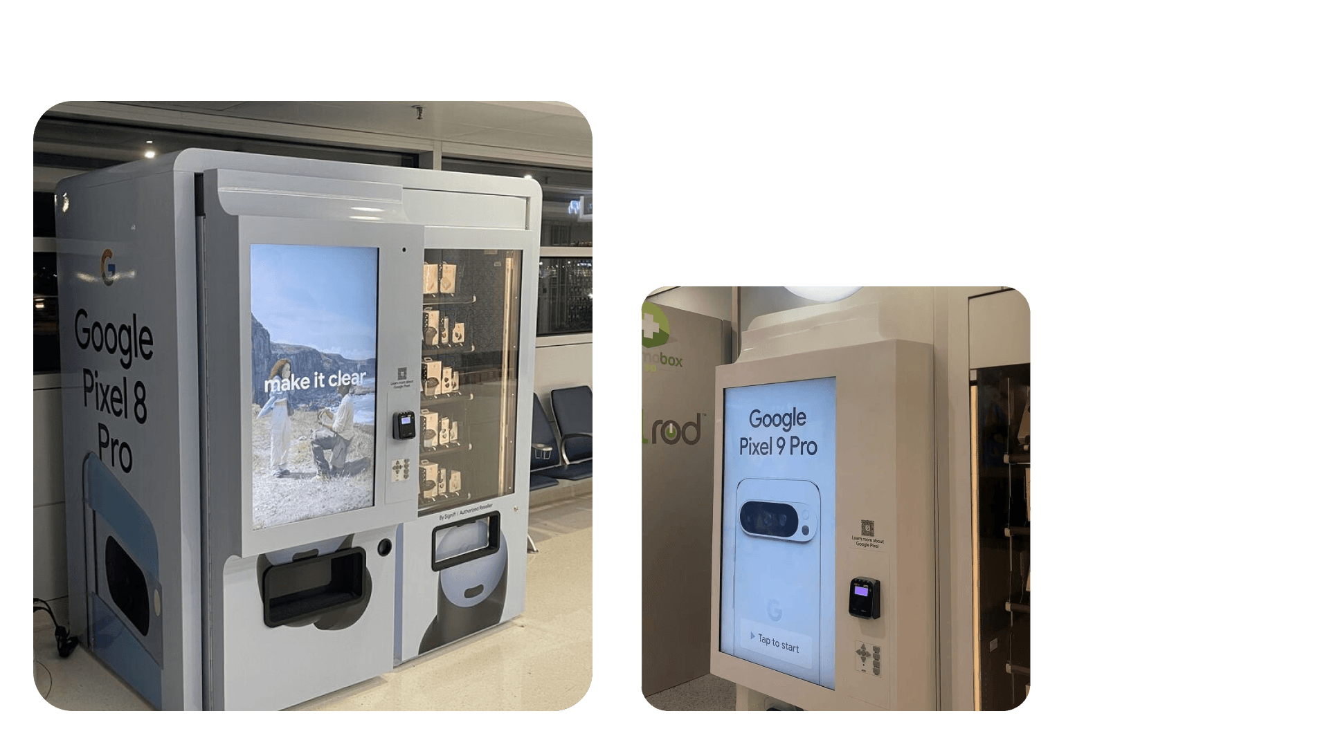
The interface wasn't sitting inside an app. It was part of the product experience itself.
Result
A new touchpoint for Pixel discovery
The project transformed a transactional vending machine into a digital retail experience.
Travellers could discover Pixel, learn about its ecosystem, explore Google Fi, and interact with Google's products before making a purchase.
Reflection
Designing beyond the screen
This project changed how I think about interfaces. When a screen exists inside a physical environment, the interface is only one part of the experience.
Distance matters. Context matters. Attention matters. Physical surroundings matter.
I learned to design not just for the interface, but for the entire environment surrounding it.
Project details
Client
Partner
Role
Platform
Location
Focus