Case study
Google Pixel
Bringing the Pixel Experience Online: An Experiential Marketing Web App
Overview
Communicating what it feels like to use it
When Google launched the Pixel 9 Pro, the challenge wasn't communicating what the phone could do. Spec sheets, product photography, and reviews already handle that. The challenge was communicating what it feels like to use it.
Reading that Magic Eraser removes objects from photos and actually dragging your finger to erase someone from a photo are two very different experiences, and only one creates purchase confidence.
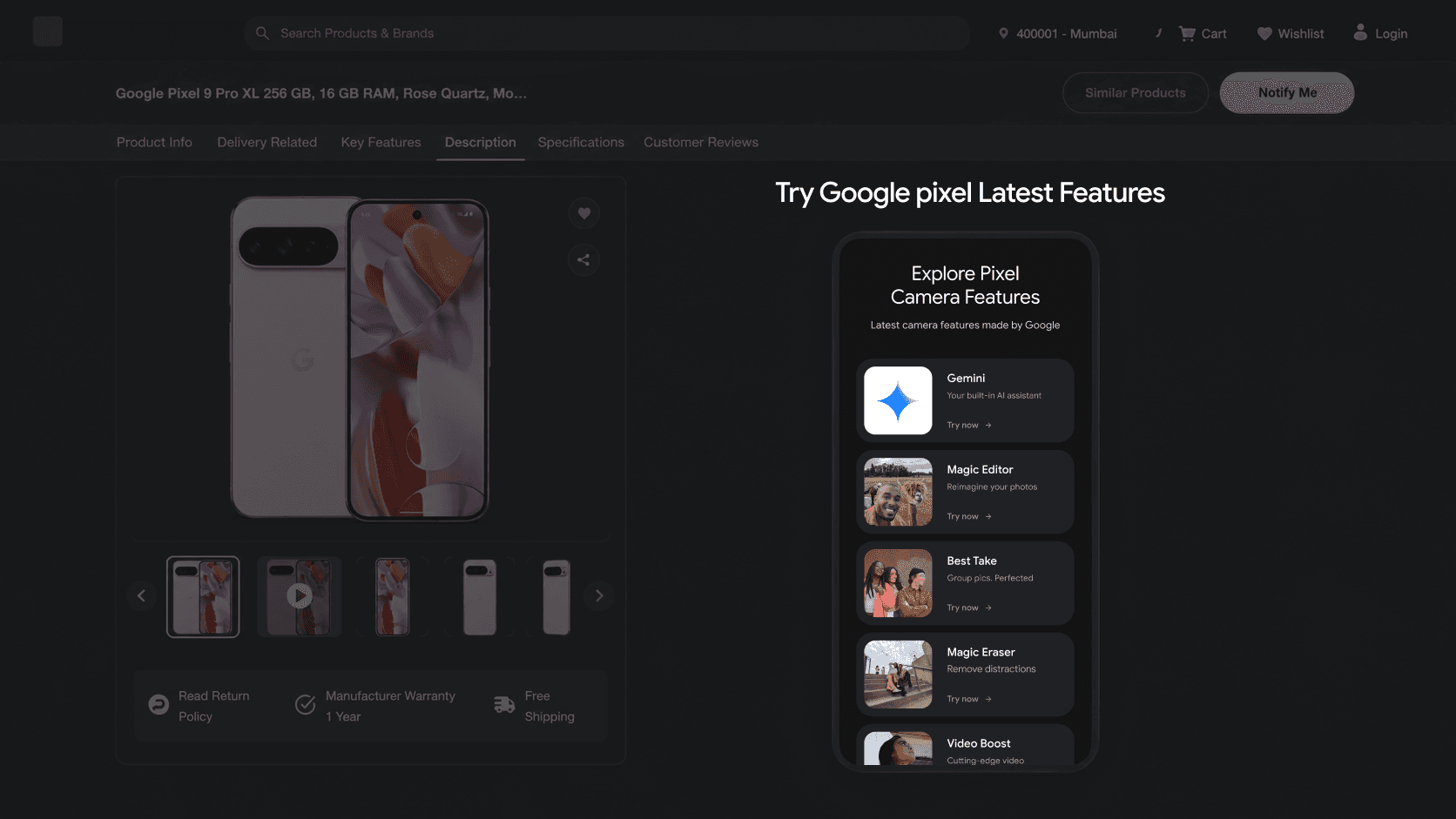
I led the design of a browser-based web app that simulates the Pixel's interface on retail partner product pages, letting shoppers try Gemini, Magic Eraser, Audio Magic Eraser, and Pixel Screenshots before ever holding the device. It now runs as an embedded iframe on 10 to 12 retailer sites globally.
The problem
Product pages are built for information, not experience
Online product pages are built for information transfer, not experience transfer. For a phone like the Pixel, where the differentiator is increasingly software and on-device AI rather than hardware specs, this is a real gap.
Photos and demo videos are passive.
The shopper watches someone else use the feature; they never use it themselves.
AI features are hard to explain in words.
"Erase unwanted objects with AI" means little until you've dragged a selection over a photobombing stranger and watched them vanish.
Retail partners have limited incentive to build this themselves.
Each retailer runs its own site, design system, and CMS, so building a rich interactive demo per feature, per phone, per retailer was not something any single retailer would invest in alone.
The brief from Google was effectively: give shoppers a way to “try before you buy” the software experience, at the exact moment they're deciding whether to purchase, and make it scalable across a dozen retail partners with completely different websites.
Goals
What the experience needed to achieve
Active use, not passive viewing
Let shoppers actively use flagship Pixel 9 Pro features, not just watch or read about them.
One experience, many retailers
Design one core experience that could be embedded consistently across 10 to 12 retailer sites with different design languages, without feeling like a foreign plugin.
Understood in seconds
Shoppers are mid-purchase-decision, not signing up for a tutorial, so every feature demo needed to be self-explanatory within seconds.
Feels like a real phone
Make the experience feel like using a real phone, not a marketing carousel, so the emotional payoff ("oh, that's actually cool") lands.
My role
Owning the experience end-to-end
As the designer leading this project, I owned the experience end-to-end.
Feature curation
Shortlisted which Pixel 9 Pro features were both marketing priorities and demo feasible.
Interaction & UI design
Designed a phone shell interface that mimics native Pixel UI, simplified for the web.
Simulating AI behavior
Built scripted flows that still felt like the shopper was performing the action themselves.
Cross retailer consistency
Defined a neutral, Google branded frame that stayed consistent across every retail partner site.
Stakeholder alignment
Presented design decisions to Google stakeholders across multiple review cycles.
QA across markets
Validated the experience across retailer sites in India, Australia, and beyond.
Process: Discovery & feature audit
Mapping features by priority and demo feasibility
I worked with the Google team to review the full Pixel 9 Pro feature set and map each feature against two axes: marketing priority and demo feasibility. Could it be meaningfully simulated in a browser without native hardware/AI access? This narrowed the list to a handful of high-impact, highly demo-able features.
Process: Defining the interaction model
Short, guided “try it” flows
Rather than a passive carousel, I designed each feature as a short, guided flow:
Gemini: a scripted chat letting the shopper ask a few pre-set prompts and see real AI responses.
Magic Eraser: a sample photo with a removable object the shopper drags to erase.
Audio Magic Eraser: a noisy clip where the shopper drags a slider to hear the noise fade.
Pixel Screenshots: a simulated library where the shopper searches by content and the AI surfaces the right result.
Each flow was deliberately short. The goal was a 10 to 20 second “aha” moment, not a full tutorial.
Process: Designing for embedding, not a standalone app
A brand-owned moment, not a third-party widget
This was the trickiest constraint: load inside someone else's website without feeling bolted on, and stay visually consistent whether the host was Reliance Digital or JB Hi-Fi.
I designed a self-contained “phone in a frame” treatment, a realistic device bezel with Google's own visual language, so it read as a brand-owned moment rather than a third-party widget. Engineering handled communicating its dimensions and load state to the host page so it never appeared broken or cut off.
Process: Iteration & rollout
From stakeholder review to 10 to 12 retail partners
The design went through multiple review cycles with Google stakeholders, refining which features made the cut and how “real” the simulated AI needed to feel. The same experience then rolled out across 10 to 12 retail partners in multiple markets, each needing its own placement and technical integration.
Key design decisions
Feeling over fidelity
Scripted realism over open-ended simulation
Live on-device AI wasn't feasible in a browser, so I designed scripted flows that still felt responsive and personal to the user's own action.
One experience, many hosts
Instead of customizing per retailer, I designed one strongly Google-branded frame that stayed consistent across every retailer's page.
Short over comprehensive
I pushed toward much shorter interactions than early tutorial-style explorations, betting a fast "wow" moment converts better than a thorough walkthrough.
Challenges
Designing for unowned environments
Designing “AI” without live AI
Simulating Gemini and Screenshots search with pre-set content required careful choices so it never felt scripted or fake.
Consistency across 10 to 12 unrelated codebases
Every retailer's site had different structures, speeds, and visual noise, so I leaned on a self-contained visual frame rather than assuming control over the host page.
Balancing Google's standards with retailer real estate
Retail partners want their own promotions on the page, so the experience had to earn its placement without overstepping into their site.
Outcome
Live across 10+ retail partners
700 to 900+
Users in the first week
10 to 12
Retail partners globally
4
Flagship features simulated
The experience shipped and is currently live embedded on Pixel 9 Pro product pages across 10 to 12 retail partners globally, including Reliance Digital in India and JB Hi-Fi and Harvey Norman in Australia.
It's live today on Reliance Digital's Pixel 9 Pro product page, embedded below the feature section.
Reflection
Designing for a moment, not a destination
This project sharpened how I think about designing for a moment inside someone else's journey, rather than a destination in its own right. The user is mid-decision on a retailer's page, and the design has one job: build enough confidence, fast, to move them toward a purchase.
It also taught me to protect a strong, singular experience while accepting that it will render inside a dozen different, uncontrolled environments.
If I were to take this further, I'd want to explore instrumenting the experience to measure feature-level engagement, and feeding that back into which features Google prioritizes marketing next.
Project details
Client
Partner
Role
Platform
Markets
Focus